What Does A Game Designer Do?
The game designer on the team is like the architect of a building. The architect
doesn't actually pour the foundation, wire the electricity, paint the
walls, or decorate the rooms. But a good architect knows something
about all those disciplines to ensure that the final product is excellent. Similarly, a
game designer doesn't actually program the game or create the art, but is ideally familiar
with all game development disciplines, and creates the blueprints for the game.
As I tell students in the first session of my Introduction to Game
Design course, it takes four primary roles to make a game:
- Programmers, who build the game. Also called Engineers.
- Artists, who create art for the game, including 2D and 3D assets.
- Producers, who facilitate communication and manage the schedule and budget. Also called Project Managers.
- Game Designers, who decide how the game should work and describe it to everyone on the team, usually through written communication.
There are many other roles that are valuable when making a game, including:
- Audio Designers, who create the sound effects and music for the game.
- Writers, who write any dialog and story for the game.
- Quality Assurance Testers, who test the game to ensure it works as the game designers intended. Also called Testers, Quality Control, QA, or QC.
- Marketing experts, who advertise the game to ensure it gets played.
- Business experts, who consider market opportunities and revenue models.
For details on even more roles, read this blog post by Liz England. Game Development is the interdisciplinary process of making a game.
I prefer to work on small teams (~6 people), which often have
a single person doing both the game designer and producer role. I typically spend
half my development time doing game design tasks and half doing
production tasks. Many people have a sense of what producers (aka
project managers) do, like scheduling meetings, maintaining task lists, and
ensuring everyone on the team has the tools they need to do their jobs well. Many
people are less familiar with the day-to-day work of a game designer, which
includes writing documentation, playtesting the game, and communicating with the
team.
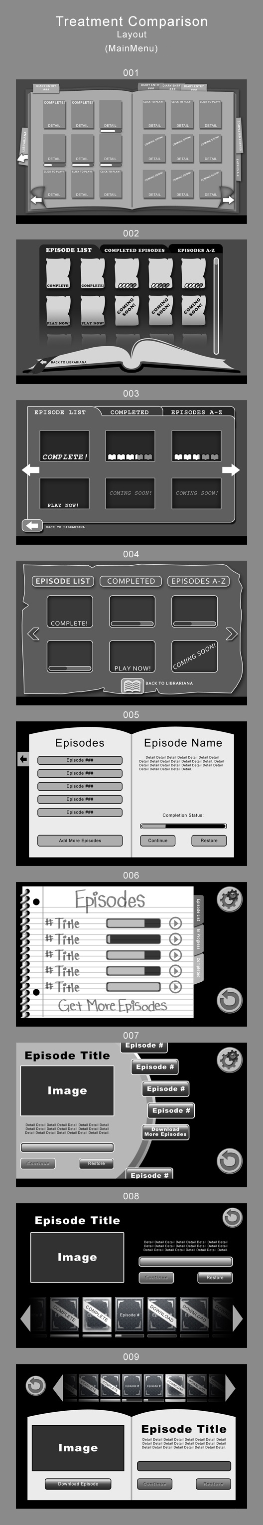
I've included one example below that shows a sample of the work
I did as a game designer when interacting with an artist on a recent project.
We were working on The Tomes, a
Choose-Your-Own-Adventure graphic novel for 6th graders, designed to help them
learn English vocabulary. As you'll see, I worked collaboratively with the
artist to steadily improve a particular menu screen, which required a total of
13 versions to finalize it.
From here, you may want visit my scholarship review page.
Designing the Main Menu of The Tomes
Initial Design from the Game Design Document
Written by Ira before the artists started
Episode selection screen
- Easily able to add more episodes over time, using an established format that the writers/content creators can follow.
- Track progress through each episode (not started, in-progress, completed)
- Sortable by completion status, name, etc.
- Episodes have a name, status, and possibly other data (rating? High score? Length of time to complete?)
Buttons and UI
All touchable elements should have a touched state, which is visible when the player is actively touching that element. The action from touching that element should occur once the player lifts up his or her finger. Assuming the button is stationary (and not some draggable object), if the player touches the button and then drags away from the button before releasing, the action from touching that button should not occur. Instead, the button should revert to its normal state as soon as the player drags away from the button (with some reasonable tolerance for accidental dragging.)
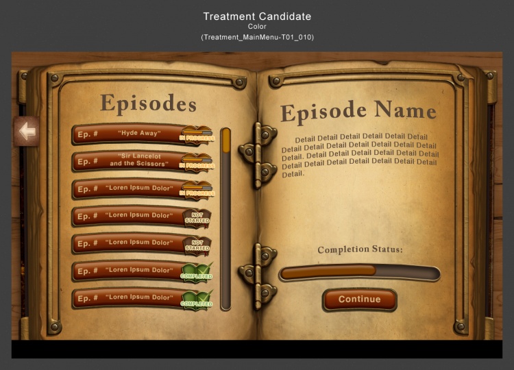
Version 1
Mar 16, 2012, 8:23:08 pm
Response from Ira
Mar 17, 2012, 10:18:50 pm
Since this is an educational game, I don't think we actually need to download more
episodes. We'll ship with all the episodes we have, and if/when we want to add more
episodes after the initial launch, Wgen will be able to modify the .json, add a new
episode, and include it in the next iteration of the overall bundle. Or we'll do that for
them. All of this is to say: I don't think we need to build a dynamic download system for
the content, which should hopefully be much easier than what SHS did.
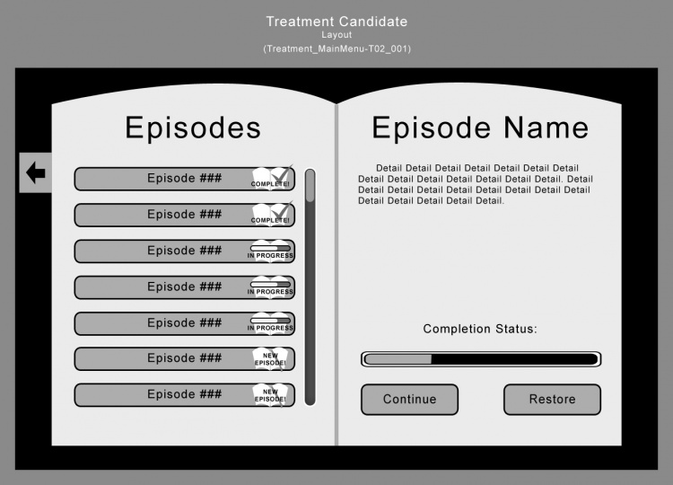
Regarding the art, I find many of these sketches a bit overwhelming. I like 005 for its
simplicity, though I think we could add a bit more spectacle without a problem. I like
that it clearly shows the list of episodes, the progress on that episode, and the episode
description. I think we'll probably ship with <10 episodes, but we should build the UI to
be prepared to handle 50-100 episodes in the long run while remaining very usable.
Therefore, I don't think we actually need a way to sort the episodes, but we should have
some easily recognizable icons by the episodes that have been completed, and a different
icon for episodes that have been started.
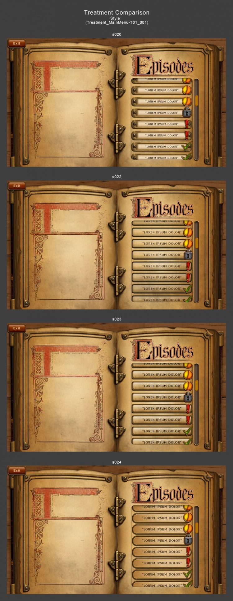
Version 2
Apr 02, 2012, 8:53:19 pm
Response from Ira
Apr 23, 2012, 10:38:17 pm
On the left, I think it would be nice to have space for episode name as well. Instead of
"new episode" I think it could be "not started." What does the Restore button do? I like
the completion status bar. I think the list should be sorted with started-but-unfinished
episodes first, then not started episodes, then completed episodes.
Version 3
May 17, 2012, 8:56:06 pm
Response from Ira
May 21, 2012, 1:41:24 am
The three different states for the episodes (not started, in progress, completed) feel a
little too similar to me. Could you differentiate them more, perhaps by color as well as
text?
Version 4
May 28, 2012, 5:28:04 pm
Response from Ira
May 28, 2012, 9:34:21 pm
Looks great, though I still feel like the three different states for the episodes (not
started, in progress, completed) are a little too similar to me. Could you differentiate
them more? I'd like to be able to tell the difference at a glance. Maybe the whole
episode button itself changes color based on the three states?
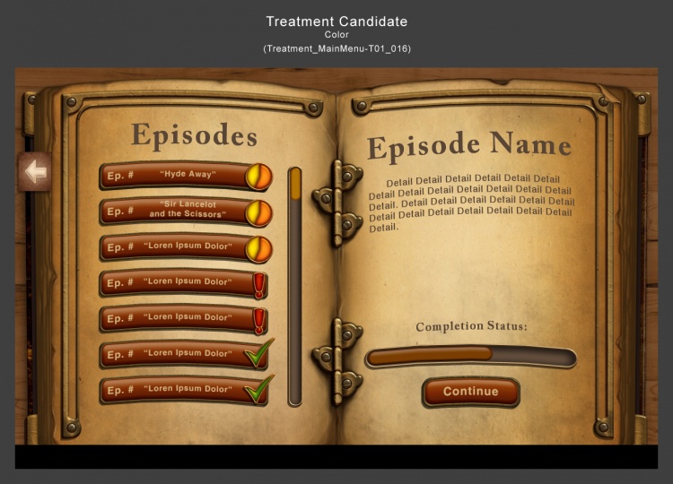
Version 5
Jun 01, 2012, 6:32:06 pm
Response from Ira
Jun 04, 2012, 12:15:08 am
I'm sorry I'm doing such a poor job explaining my change requests. I think the recent
iteration made some progress, but I still feel like each icon is too small to be
differentiated. Let's try removing the text on the icons completely.
Try these three icons:
1) Exclamation point (think WoW quest icon)
2) 60% filled pie chart
3) Thick green check mark
We can also discuss this during our weekly meeting, to ensure there aren't too many more
necessary iterations. Thank you, and sorry for my poor communication before!
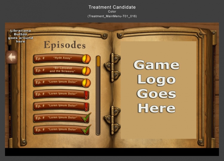
Version 6
Jun 14, 2012, 6:16:33 pm
Response from Ira
Jun 17, 2012, 10:47:41 pm
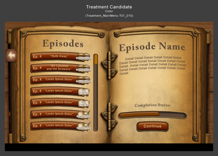
Looks good! Let's give it a try. Note that for the minimum required implementation of the
Episode List, we will instantly start the Episode as soon as the player touches the
Episode button, so there isn't any Episode description on the right. Instead, we'll just
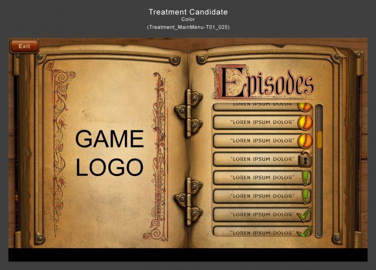
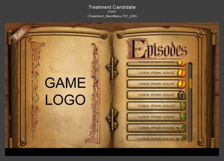
show some art, like the Game Title.
Also note that we need a "Librariana" button on this page in the upper left, which exits
the app and returns the player to Librariana.
Extra Response from Ira after Playtesting
Jul 05, 2012, 10:58:06 am
As we discussed on our call, we're going to make the following changes.
First, it's worth noting that the Main Menu page has two states: NORMAL and LOADING.
NORMAL State:
- "Exit" button in the upper left.
- Game Logo takes up the whole left page.
- Remove the metal hinges in the middle of the book
- Right side has the word "Episodes" at the top.
- The Episode buttons have a more paper-like quality, similar to the buttons shown in
Dropbox / Vocab Shared / Art / Concept Art from Wgen / Menu Screen / Menu_Book2.jpg. The
buttons don't need to be an exact copy, but they should be more paper-like than our
current buttons. (Note: Keep using the current Episode Status Icons that are already
implemented in game)
LOADING State:
- As soon as the player touches any Episode button, the Main Menu changes to the LOADING
state. It's the same as the NORMAL state, except for these difference:
- "Exit" button in the upper left fades out quickly.
- All Episode Buttons disappear, and are replaced with the Episode Name, the Episode
Description (text), and the "Loading..." message at the bottom with animated dots.
If time allows, the LOADING state will also include some/all of the following:
- Episode Description specific to the player's progress in the story (instead of the same
text each time).
- Some image specific to the episode (or if we want to get really fancy, an image specific
to the player's progress in that episode)
Version 7
Jun 24, 2012, 12:21:33 pm
Version 8
Jun 27, 2012, 1:44:33 pm
Version 9
Jul 06, 2012, 7:15:13 pm
Response from Ira
Jul 10, 2012, 11:43:10 am
Here's the feedback that we discussed on the call today:
- Move forward with s022.
- Change the lock icon to be brass
- Remove the hinges from the center of the book
- On the left page, remove the ornate "T" from the top half of the graphic, leaving just
the empty box below it. In place of the ornate T, put "Game Logo" so it's clear to Laura
and anyone else reviewing it that it's the placeholder game logo.
- Standby for additional feedback on the Exit button. The current location feels
disconnected from the rest of the scene, even though it was exactly what I asked for.
I'm sorry I was wrong! We'll fix it. Laura said she had a suggestion which she'll mock up
this week. Let's wait until we hear back from her before spending more time on the exit
button.
- The Episode List shouldn't scroll at all if there are 7 episodes or fewer. UI element to
the right of Episode List should be hidden if the list doesn't need to scroll. This will
defer the issue of scrolling to post launch.
Version 10
Jul 11, 2012, 12:30:23 pm
Response from Ira
Jul 11, 2012, 1:43:59 pm
Great progress!
- Remove the hinges from the center of the book
- Please also do a version without the scroll bar with 5 episodes on screen.
Version 11
Jul 27, 2012, 7:30:31 pm
Response from Ira
Jul 27, 2012, 11:10:29 pm
I like the exit button better than before, but I don't think it's perfect yet. I think the
white stroke around the letters makes the word feel a bit fuzzy, with the letters blurring
together. Could you try it without the white stroke and/or with a few more pixels of space
between each letter?
Version 12
Jul 31, 2012, 4:36:58 pm

Version 13
Sep 28, 2012, 6:33:53 pm
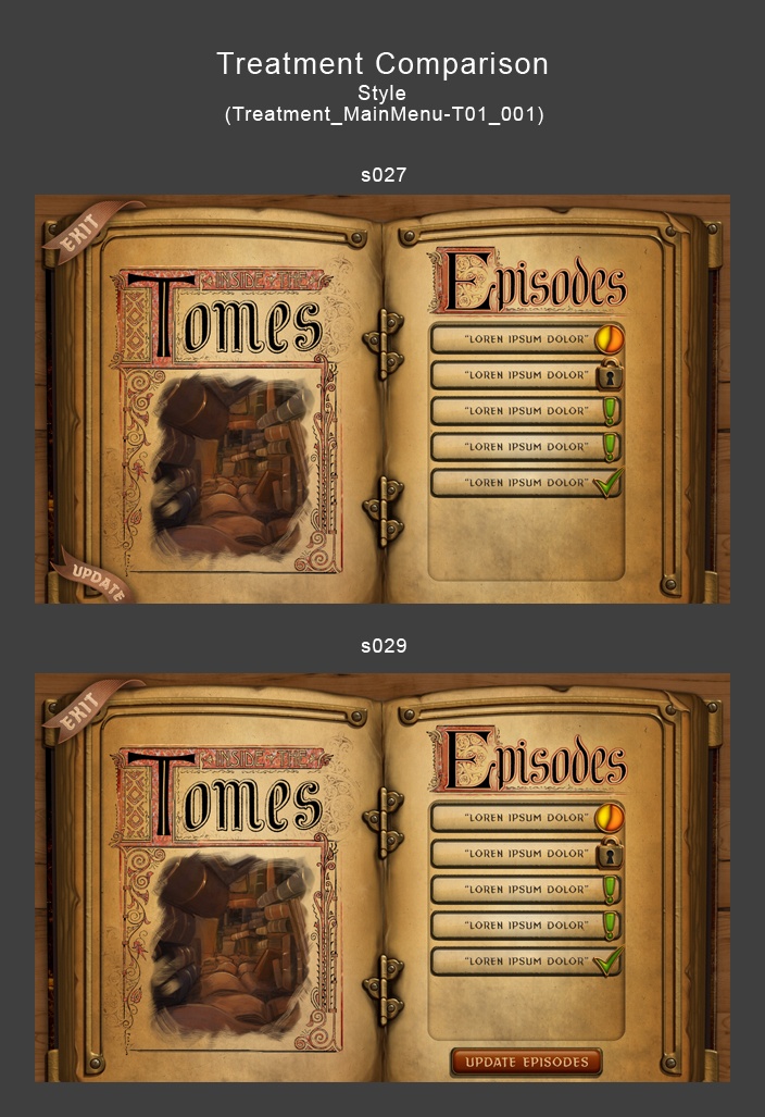
Response from Ira
Sep 28, 2012, 7:16:34 pm
s027 is better than my idea! Let's go with it. Thank you for thinking of it. I also think
that will be less work, since nothing with the list of episode buttons will need to
change. Thanks!